|
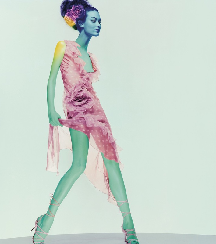
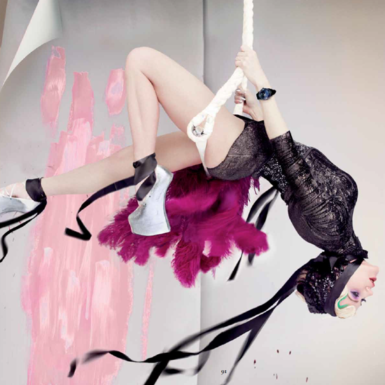
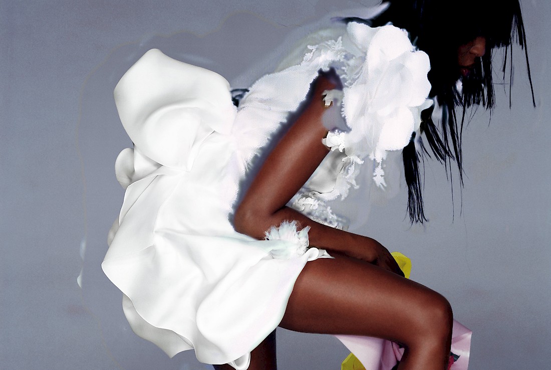
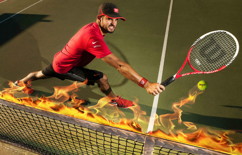
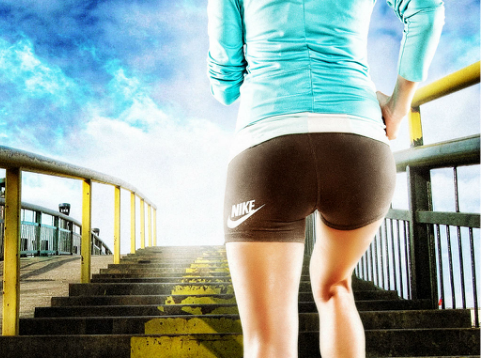
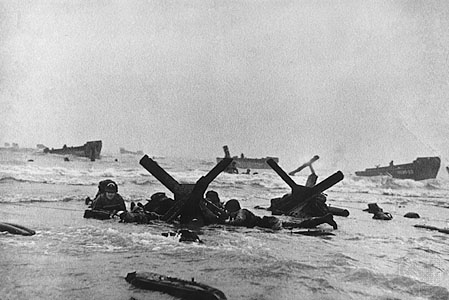
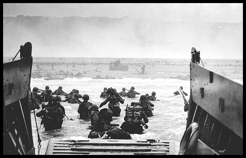
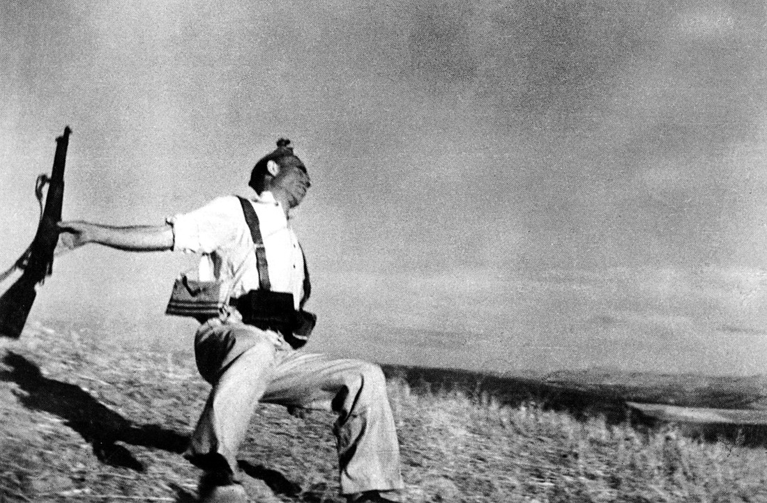
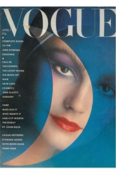
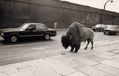
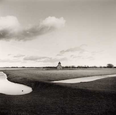
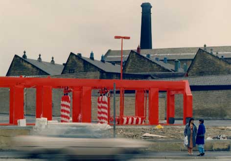
In photography there are ranges of types of photography, such as from fashion to architechural photography. In this post i will be exploring 5 variations of photography and explain how a single artist uses this type of imagery in their own individual way. FASHION In the gallery above the images approach the audience with a delevopment and unusual style of fashion. The images are all using different postures and postions. The artist for this group of work is known as Nick Knight. Nick Knight is a famous photographer in fashion and other developments. Nick makes his worl successful by using a style in which works known as a contemporary style. If you look at all three images each image is using the same type of lighting which is front lighting. Nick does this to show the true colours of the images. He also uses the same bright colours as if its a signature for his work, but this works as Nick has a basic background image for each images aswell. In my personal opinion my most prefered image above is the second image shown in the gallery. The reason i like this image is how the main focus point is the fashion but the additional feature in ther image just makes a finishing point for the image. Such as the paint of the wall behind the model links into the image to show a 3D perspective when looking at the fashion. The first thing that catches the human eye in this image is the bunch of feathers which then relate back to the paint wall. Overall i like this image as it shows great depth and contrast. ADVERTISING These next few images are all to advertise and promote each of the brands seen in each image. The artist for this work is known as Riccardo Suriano. This famous artist is an italian man who uses his skills wisely. He does this by using unusual features such as the flames in the first image. This would come across as a fast movement captured in an image to show speed in an image. My favourite image in the range above is the final image as this shows a good depth in an image. The stairs in the image leads the eye to a focal point but before the eye is drawn to the focal point you notice the brand being promoted instantly. This follows the focal point in the image as if your being lead over this bridge with the brand and it stick with you until you have this brand youself. DOCUMENTARYThis documentary art is delvoped by the artist Robert Capa. Capa uses art and reinactments from world war one in his photography. The last image in this gallery is call 'the falling soilder' and this image comes across with depth and range. In this image the basic photography skills are used. Capa was a classic photographer and uses the rule of thirds in his imagery, also he uses mid shots to show the focal point aswell as a basic surrounding to give more of a mind set to where you would be if you was involed in the image. My favourite photo in this gallery is the second one in this collection of images. This is because in this image you see everything involed in the world war as if you are entering the war zone from the basics of the boat. This image also shows a long range distance to see whats ahead of you. In the features of the monochrome overlay this image gives off even more of an approach to an audience in which this photo approaches. The audience is also for everyone as it shows variation in every way from landscape views to a column of soliders leading you into the photo. PORTRAITUREThe images above show a simlar range in work. The images all range from each other with the posture of the model.The artist that created these masterpieces is David Baliey, Baliey apporaches the audience with the 'waves and curves' in his photography. In the clothes or hair of even just an effect creates an curve or wave to follow with the eye. These are the focal points in the imagesand are also the most brightest colours in the image to get straight to the point. The most prefered image for me is the first image with the blue overlay, this is because Baliey uses a great focal point to catch the eye, this is a great way to look at the image in depth as the blue dulls out the surrounding to have a focus point central in the image. LANDSCAPEThese wonderful pieces of art came into landscape photography through Fay Godwin. Godwin is a landscape photographer who In the 1990s she was offered a Fellowship at the National Museum of Photography, Film and Television (now the National Media Museum) in Bradford, which pushed her work in the direction of colour and urban documentary. In the images above each photo has an unusual and unique meaning.
when doing photography it isn't all just about getting to the point. We all need to take in mind that you need to successfully do photography without any hazards getting in the way. To prevent this we all have to follow health and safety regulations. The HSE (health and safety executive) have set a few rules and guidelines for us to be safe when using our photography skills. This book also follows the laws in which we have to follow to be safe as well.
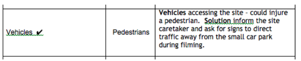 In the Health and Safety at Work etc. Act 1974, Chapter 37 explains the vital point and purpose of the sate of the law. If you look below this paragraph is taken from chapter 37 it explains how the law needs to put out for working in a safe environment. CHAPTER 37 An Act to make further provision for securing the health, safety and welfare of persons at work, for protecting others against risks to health or safety in connection with the activities of persons at work, for controlling the keeping and use and preventing the unlawful acquisition, possession and use of dangerous substances, and for controlling certain emissions into the atmosphere; to make further provision with respect to the employment medical advisory service; to amend the law relating to building regulations, and the Building (Scotland) Act 1959; and for connected purposes. This sheet below is a risk assessment and needs to filled out so projects are managed properly when approaching a hazard.  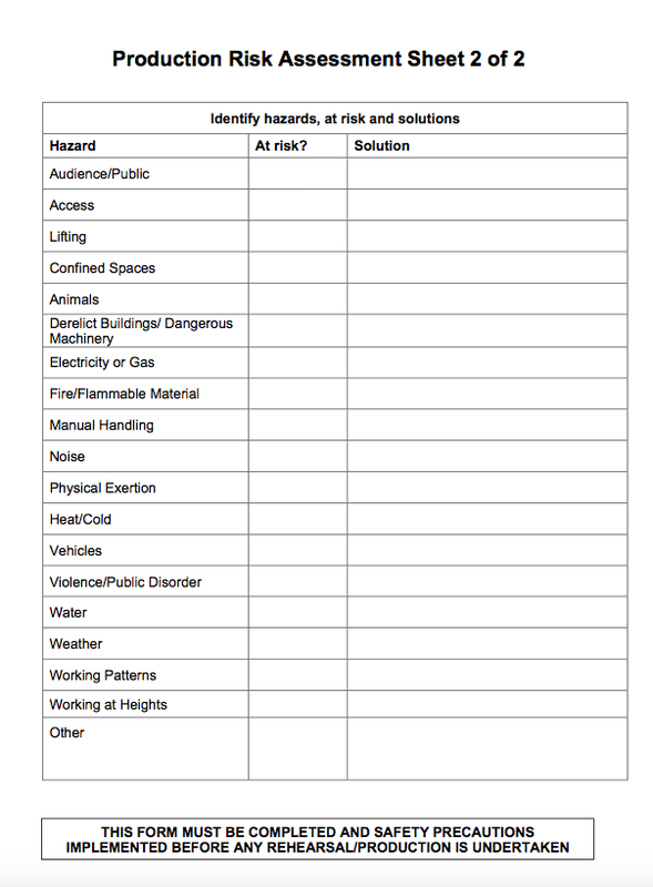 looking at the images below you can see how the background subject varies in focus throughout the images. This is know as depth of length, Contrasting between aperture and focus. To make out a successful image using this method, you must keep the focus the same and only change the aperture to change the focus length. Each of the images create a different perception when each picture is taken. The best way to look at this is going through each aperture setting E.G. (F10, F11 and F23). Looking at the ninth image you can see how both subjects are in focus this shows a successful experiment on aperture and focus.
Here is a series of images which use architectural photography. These images show perception a focal points. such as image number 1 as the tunnel follows itself to a focal point using the human eye but we all know that this tunnel doesn't get shorter towards the end. If the image is taken from different angles it gives off a different perception such as the church pictures. The image looks like the ends will meet on 4 but not on image 5.
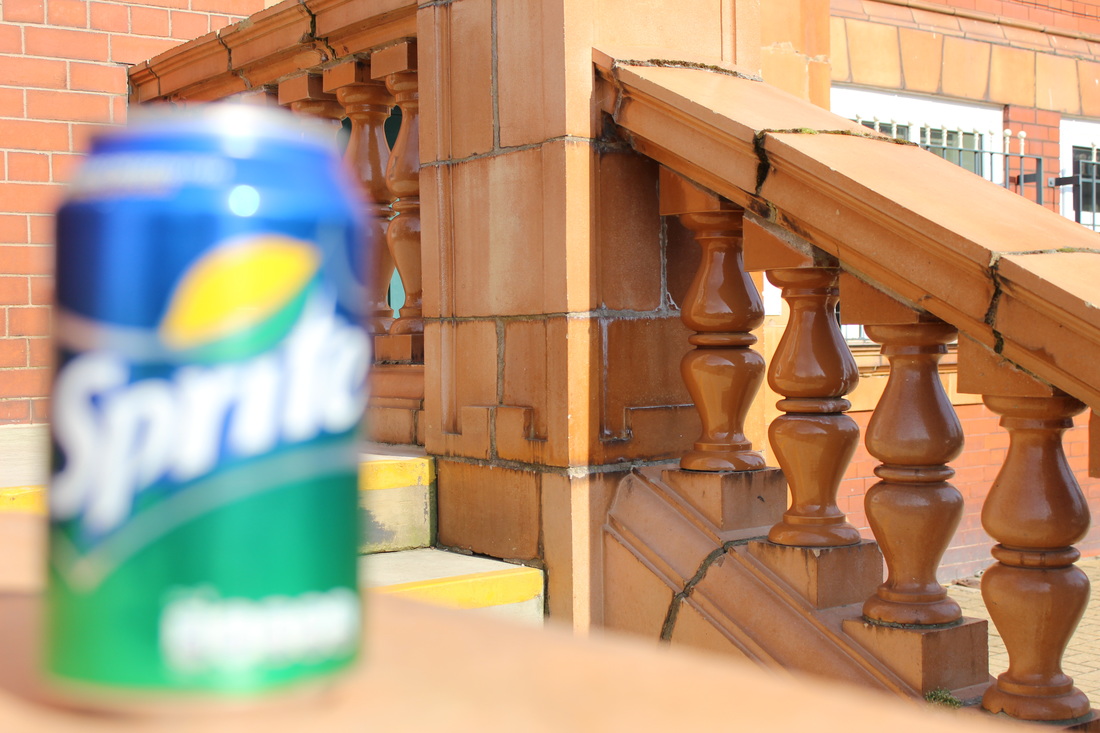
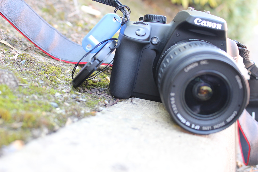
in this post i will be exploring how photography uses focus and how its elements make images better when using a subject to evaluate. These images above show focus in different subjects, The can of sprite is showing variation of focus as the background is focused on one , the other is the can in focus. the camera image focuses on only half the camera which give a central focus as both sides of the image are drawn in to one point, unlike the can of sprite where there is a variation in focus points.
In this post i will be exploring exposure using only shutter speed at different ranges. This is the final way to change the exposure using elements. If you look in the slide show you will see motion blur in some images and in others a motion freeze such as in mid air in one of the photos. In photography there is one key feature which is exposure. Exposure is the lighting in an image and is all altered by other elements used on a camera. The exposure is made up of three elements which are, ISO, aperture and shutter speed. in this post you will see how only changing one element will not work when the range between each element is so far apart. The one feature i changed was the ISO without altering anything else and here is my results. when changing one element the best Iso to use in these images are between 200 and 400 iso for the best results. this is shown in the graph in the below image, This is good exposure as the graph shows a central scale. 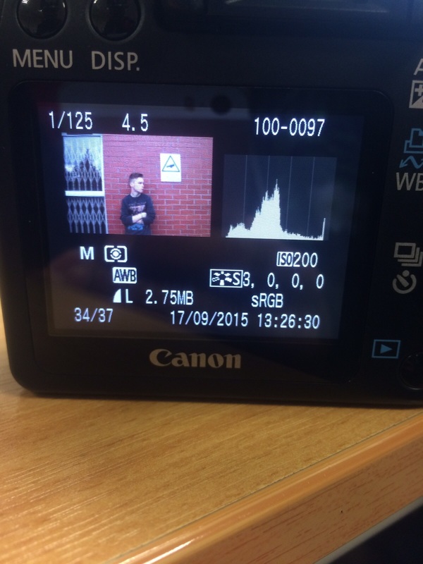 In this post i will be exploring how the aperture is effected when only changing itself. Like the previous post i used ISO to explore the exposure. This is the same, I kept the ISO and Shutter speed the same and only changed the aperture. Below the slideshow will show how only changing the aperture changes the exposure differently. In the slideshow above if you look through each image you will notice how they range from high to low in lighting. This happens as the exposure is not being altered to all three elements, when using aperture the lighting changes but not with the rest of its elements for a successful image. Number 7 in the slideshow is the best exposed as it shows not to little or not to much lighting. This aperture level is F7.1 in the scale, The way it works is the higher the aperture the darker the image but the lower it is the brighter the image is displayed. 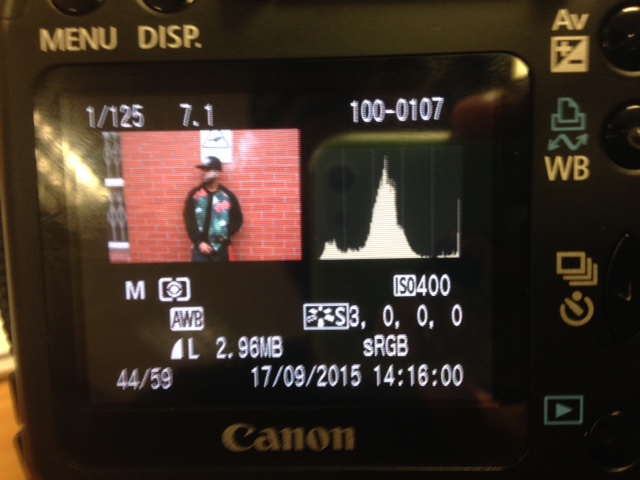 When taking photos there are many angles to explore apart from eye level (neutral level), if you use different angles then its shows variation in the subject in which you are taking a photo of. There are 5 different angles in which you could explore, If you look at the image below it shows the different angles in stages.  The angles all give a different view or perception on the subject depending on the angle used. for instance if the birds eye view is used you would focus on the top of the subject and its surroundings. Here are some examples of my own and an explanation to understand more. 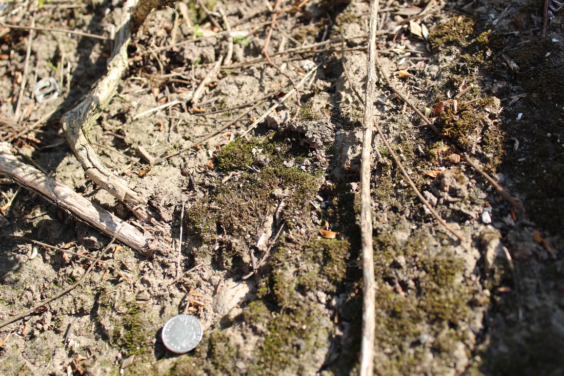 This is a birds eye view, this shows surrounding of a location but with a subject (5 pence). 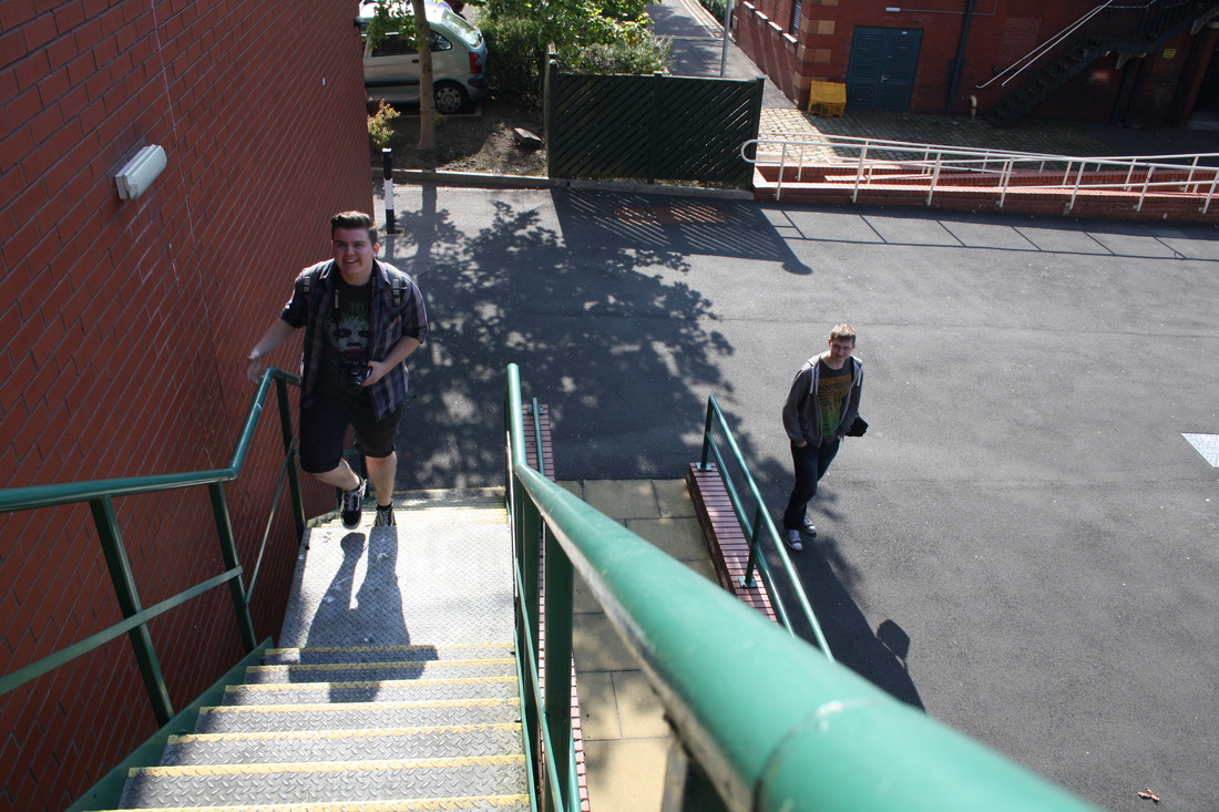 This type of shot is a high view shot, what this shot does is give authority to the viewer to show powerful and strong views, The image which was taken shows power as the angle is looking over someone, not someone looking over you. 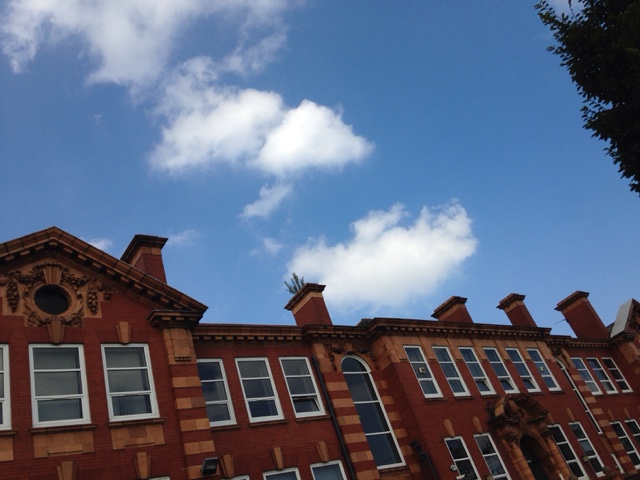 this type of shot is a low view shot this shows detail in both ranges of a subject such as this one, The view of the building is also showing what is surrounding the building by using this shot type. 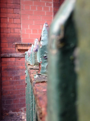 This type of shot is known as a neutral shot, this shows the perception of the subject directly on eyes point. The view of the image is shown as if this is directly in front of you.  This type of shot is a worms eye shot, this shot expresses the detail as if you was at ground level looking up and out (like a worm) this is another great way to express an images features.
|
InfoIn this blog i will be sharing my shills in media and explaining how things work in the industry. |


 RSS Feed
